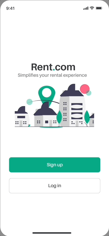
Rent.com
Hassle free rental home experience
Role: User Researcher, UX/UI Designer
Duration: 6 months
Project: It's a self initiated solo project that I picked in 2019 to improve rental experience for people moving to new cities.


Background
The idea for this project was conceived from a problem I faced personally while looking for rental flats. Like many others, I decided to rent a flat in the year 2019 when I moved to different city for work. What started out as a fun and dream come true, spur-of-the-moments ended in frustrations with poor decisions and overall bad experience.
Problem
People are often required to move to a different city for job related purpose and higher education. They frequently try to find a rental place that’s homely and comfortable. However, finding the right place that matches your needs & expectation is tough and time consuming. After devoting over a month on several platform, you are still left confused with no concrete decision made.
Goal
To identify opportunities and design a simple, easy solution to improve rental experience for people moving to new cities.
Qualitative Research
User Interviews
To gather underlying issues, I conducted series of interviews with tenants having variety of rental experience in last 5 years. I've asked them questions to find trends on why they failed with their flat hunting versus others who got it at first attempt. I interviewed 10 participants, 5 males and 5 females, ages of 22 to 34. They were recruited through my personal network, such as friends and family.
Shivani
“It’s a strange new city, I had no idea what kind of localities/areas to search for.”
Paulami
“Which app/websites to use? All of them had overwhelming list of properties that only added to my confusion.”
Rahul
“If I didn’t get what I wanted by typical few searches & filters, I used to jump to different app/website.”
Ayan
“Verifying a locality and properties eventually the most chaotic & difficult part of whole process.”
Chinju
“Presence of any familiar or relevant body nearby your flat, helped me feel comfortable and safe living their”
Surya
“Without any recommendation, It’s hard to trust online apps, websites, brokers and even owners.”

Quantitative Research
Online Survey
I also did an online survey to quickly gather data from larger group and analyse it all statistically to get a holistic view. A total of 20 people responded which assisted me framing the problem statement correctly. With all that, It got clear that the key features that have a profound impact on the app experience is Onboarding, Search & Result page. A few sample questions are listed below
-
How often have you been required to move?
-
Do you use online platforms/apps?
-
Which important factors do you look for while searching rental property?
-
Which platforms/apps have you used the most? How was it helpful?
-
How long did it go until you settled for your final rented property?
-
Did you encounter any difficulties or issues while using these apps? If yes, please specify.
-
What was the most challenging part of whole flat hunting process?

Comparative Analysis
#1 Onboarding
Onboarding is a great way to collect profile information that can be used to deliver customised content based on persona in the beginning itself. Primarily it is the first point of contact, thus it is very important ot make the process as simple and seamless as possible to make a great impression. Following are hiccups that I’ve found in competitive apps

#2 Homepage
Homepage navigation is an important and one of the most essential elements for an app. Visitors are likely to browse the listing before registering their interest in a specific property. It is vital that tenants don’t feel lost when land at home screen and try to navigate to multiple property pages.

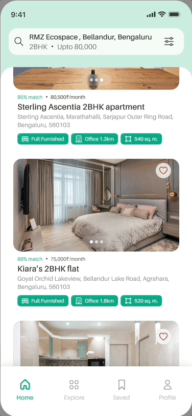
#3 Search Result Page
Search & Filters help tenants to narrow down their property choices based on specific parameters. Whether placed on top, inline, or as an expandable drop-down, the resulted listing after search must clearly provide the property details and options to further take actions on them to users.

Define
User Persona
With the data collected from interviews and surveys, two personas were created representing ideal users. These personas helped me arrive at better solutions as it gave an in-depth understanding of user needs, wants and limitations.


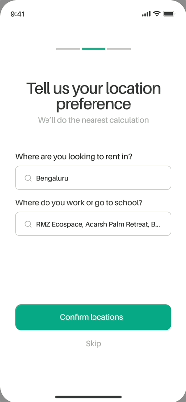
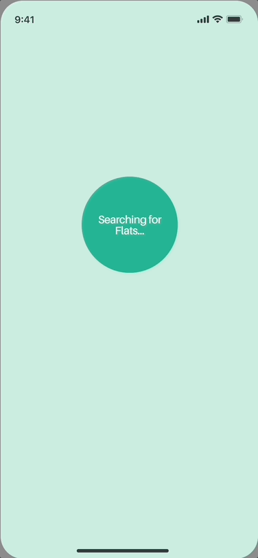
User Flow
To start making sense of navigational schemes, I used persona and competitive research. Since the app needed to be created from scratch, understanding and comparing how users conceptualise different task and actions was the key. I also needed to make sure that the flow is tailored to tenants and help them speed up hunting process by being effective and Intuitive.

Low-fidelity Design
With the use flow in mind, I started with the low-fidelity wireframes on Figma. With each design decisions, the abstract idea started to come stronger and clearer of how the screens needs to be. Using IOS guidelines and feedback from my fellow friends I iterated them multiple times. Below are few samples of wireframes I started with.


